Friday, 24 April 2009
Newport Beach Film Festival
Dvein Opening-titles F5
Last year on a university trip to Barcelona we payed a visit to the brilliant design and animation company ‘Dvein’. Previous from the visit I was completely fascinated by their work. They have a beautiful visual style and the sound that comes through their work is designed to perfection. I wont go on too much about their early work from nearer the visit but their most recent work. In particular their opening title sequence for the F5 design conference. From previous knowledge and from the visit I new that Dvein work very much with 3D animation and also live footage, bringing both together seamlessly. Their F5 title sequence consists of these 3D and live elements. At fist glimpses I could see how the title sequence was presenting the names of the design conference speakers but also had a very surreal and abstract feel to it. For example there are shots of wind turbines micro scopes, a bull dog and many more unusual concepts. Even though there is a surreal feeling to the piece the imagery and composition is wonderful. The sound of the piece is very unique also, bringing together analogue and digital sound, matched perfectly with the video edits. After research I found a post on the Motionographer blog which talks about this piece. The website also has an interview with Dvein in which Dvein explain
“When we were invited to make the F5 titles, we wanted them match the eclectic spirit of the conference. The idea was to get the soul of the speakers into the titles in some way.
We asked each speaker to name five objects that inspire them or has something to do with their work. We received all kinds of answers—really interesting objects that gave us a great starting point: wind turbines, microscopes, lights, smoke, lamb rib cage, French bulldog…
The speakers didn’t know what their answers would be used for, but they were the seed for our story. In this way, all the speakers added their bit. There is not a unique authorship but rather a multiple collaboration.”
I found this insight behind the scenes and making of the piece fascinating. The idea is very simple and as the piece is designed for a design conference Dvein were able to have full creative freedom and were not restricted by industry requirements that some time can crop up within brief. (Having to meet target audiences, meet targets within a brief etc.)
Samsung Ultra-slim LCD TV
I recently seen this new advert promoting the new Samson LCD television. After further research I discovered that the ad was produced my the creative design studio ‘1st av. Machine’. The advert is promoting the new ultra slim LCD Samson television with its focus around the quality of picture. The advert revolves around the brightness, sharpness, depth of colour etc. These qualities are shown by a magical natural scene in which a humming bird travels to different plants and trees revealing beautiful colours. This hole advert seems to of been developed in CGI, I think the main reason for this is to have full control over the imagery. In this case the control over the imagery is perfect as they can produce colours and brightnesses which are not available when using real footage. I think this advert is really effective, the advert needed to show the quality of the product in particular the quality of the TV’s screen. This adverts does this perfectly and for me the vibrant colours are very aesthetically pleasing.
Thursday, 23 April 2009
Man vs Machine
go to Man vs Machine website HERE
Man vs Machine explain them self's as being a “design, direction and animation company”, working within these areas they have produced work for “TV, film and advertising” for clients such as Channel 4, MTV, E4, Virgin Media etc.
Featured within my previous post man vs machine have produced some really nice pieces to a very high standard. I have decided to post their showreel to show their range of skills and design. I have also posted their showreel as I will be producing a showreel soon to promote my self when graduating and I think this Is a great example of how a showreel could be formatted.
Wednesday, 22 April 2009
Radium Audio Ltd
Go to Radium Audio Ltd's website HERE
After researching through many pieces of design work and also creating my own work I have noticed the importance of sound within the piece I have looked at and created. I have been looking at many sound design and sound production companies and recently came across the company ‘Radium Audio Ltd’. Their website explains that they “record, enhance and create sound that stirs emotion”. Their website continues to explain the importance of sound and how the quietest of sounds it just as important as the loudest.
“The satisfaction a Bentley owner feels when his indicator tick, tick, tick in perfectly-tuned resonance with the heritage and splendor of his vehicle. We created this sound for Bentley, to subliminally convey the brand's values and personality in an audible format.”
I was really intrigued by their sound design for the online promo for the Volkswagen Scirocco. ManvsMachine created the adverts visuals and concept but Radium Audio Ltd designed the sound. They explain what they did and how they did it explaining:
“We wanted to create something that was different from usual car related promos. There are no engines or car related sfx within this piece. The big opener, the delicate movement of the crystal, the vocal build.. all these elements build up to the final movement of the car coming into focus”
Overall I really enjoyed the discovery of Radium Audio Ltd and their work. It has furthered my interest in sound design and promoted the importance of sound within Moving Image.
Justin Harder
Go to his website HERE
Justin Harders work is amazing. His website explains that he “directs with a design background, 99% of the work on his site was written, directed, and animated by Justin. He works Harder and loves to explore new ideas.”
His website shows the eclecticism within his work as he uses a range of styles and mediums to create his piece. I decided to post a piece of his work showing his range of skills and resources. The piece is for the Faucet Manufacturer ‘Brizo’ and this piece is a short logo reveal. Using water colours and hand drawn skills this piece consists of beautiful textures and is animated revealing the logo. Overall a beautiful directed and produced piece.
Jonathan Saunders 'Nokia Eseries'
I recently discovered the designer Jonathan Saunders. His work is of a really high standard and looking at most of his work you can see that he has design directed most of the content. I really liked his piece for Nokia which is advertising the new Nokia Eseries ‘E71’
The piece consists of a unique and individual style, using bright and vibrant colours which radiate throughout the piece. The advert takes the various elements connected with mobile phones such as text messaging, music, bluetooth, photographs etc. And brings them in to life via moving image. The element are quite basic things and are probably standard on most phones but the advert brings originality and makes the advert promote the phone and how unique it is.
BBC 1 Extra 'Street Muisic'
http://www.fallon.co.uk/#/work/1xtra-streetmusic.html
I recently discovered this advert which was out a while back that is advertising the radio station ‘1 extra’ which is a BBC radio station. I think the advert is really effective. The radio station its self is based around urban music, rap, r’n’b etc. The advert reflects that genre of music and relates perfectly with the target audience that would listen to the station.
The whole advert is shot in urban surrounding with people and houses, representing again the target audience and the environment they live in. Every edit and action within each shot is linked and matched perfectly with sound clips from classic urban music tracks. So an example of this technique can be seen in the advert upon starting. The camera pans across a guy cleaning his car and as he opens his mouth a voice clip from a music track is dubbed over the top, giving the effect that he is saying it or singing it. Overall it is simple, effective and as it relates perfectly with the target audience it works well extremely well.
David Wilson 'Moray McLaren, We Got Time'
I recently came across this wonderful music video by David Wilson for the music artist Moray McLaren’s single ‘We Got Time’. I found this music video fascinating and unique. It uses a animation style based concept through out the music video. The music video is very psychedelic and when watching it is hard to tell if what you are watching is really or not. After watching the music video I found a video on youtube which is the make of the music video. When discovering this ‘making of video I was even more fascinated my it as I found out that the whole music video was a live shoot, there was no cgi elements of compositing in any of the shots. (Fascinating and incredible).
This element reminded me of the live competition brief for the 'ministry of sound' which i created earlier this year. Similar to David Wilsons piece, I too sided with the live action shot instead of cgi. I felt for that brief in particular there are certain elements within a piece of design that when they are done in a live action shoot they have a more visually interesting style and uniqueness. Also if the viewer can question if the work is really or not it can create a talking point in regards to the work (which if it is an advertisement or in this case a pop promo it is a positive thing as more people will pass it on to their friends to have a look)
As I have been developing my final major project i have also questioned whether or not i should use cgi and live shots. i discovered through my major project some shots were better suited for cgi, so i could have full control and other shot would not work as well if they wasnt live shots. below are some still shots in which i used live action footage instead of CGI computer generated images. Again i think the use of live action gives a sense of originality within a final piece whereas cgi inparticular 3D design can look unoriginal in some cases.
The director ‘David Wilson talks through the whole animation from concept to storyboards to Animatics through to the final shoot and piece. He explains that all the whole music video revolves around little animations all displayed and worked from a device called a Praxinoscope which was a successor to the more familiar zoetrope. The device is placed on a rotating record player which allows the animation to play. He further explains the frame rate for each machine saying that each Praxinoscope is made up of 16 mirrors equal to 16 frames of animation on each record. He goes on to say that he had to hand draw every frame on each device and the most challenging thing was to develop an animation that would loop in 16 frames to allow continues loops on each device.
He carries on to explain the the production of the animation and concludes saying that “one of the really interesting and nice things about this shoot was how often it felt quite surreal to be working and interacting with animation which is often a very slow process in a such a fast and live action way”
Overall I really interesting piece by David Wilson and for me it works so well because it is from a live shoot and has no CGI in it.
Monday, 20 April 2009
BC Dairy Foundation 'Mousetrap' advert
This is an advert for the BC Dairy Foundation I found today. The piece a stop motion animation which rather then tell everybody bluntly about the benefits of milk, the advert show the consequences of not having enough milk in your diet. When first watching the advert I was unsure where it was going. It starts and has a very uneasy feel to it like something bad is going to happen, and obviously when first watching it you don’t no what will happen. The piece take the scenario of a mouse trap and a mouse, giving the mouse trap a humorous personality that seems to be out to kill the mouse. The mouse is then caught by the trap and but the mouse then escapes freely because the mouse trap isn't strong enough to hold. The point being that if the trap had drank more milk it would of been stronger and able to fulfill its dream of killing the mouse. Overall the advert is very effective and uses a funny idea and story to get across the point.
Bank of Ireland
Bank of Ireland
I recently discovered a range of commercials for the Bank of Ireland. They take the concept of an old mythical story and by using irish mythical creatures such as dragons, goblins and fairies they apply the concept to their bank. The creatures that are in the adverts have their own personality and address their audience informing and relating to their target audience. I think the adverts are really effective and by using a mythical story/narrative and applying it in relation to a bank is humorous and interesting but works very well.
Watch here
Advert 1
Advert 2
Advert 3
Wednesday, 15 April 2009
Peter Saville Q & A
http://www.vimeo.com/3622243
I recently discovered a Question and Answer interview on Vimeo. The q & a session with Peter Saville is in front of the media, designers and others who ask Peter Saville a range of questions about him self as a designer and about the design industry. The question and answer session is split into several different sections as follows.
What is that?
In which Saville discusses his art work over the past 10 years. How he has developed and struggled to change from design to art.
What inspires you?
Talks about his previous inspirations and how they have changed through his career.
What’s wrong with design education?
Discusses his view on design education.
Has the computer democratized design?
How things have developed in design from the absence of computer technology to the development of the internet and a the ability to create and dispatch work. This is a discussion of positives and negatives.
What is your favorite part of the brief?
Discusses briefs and the interesting parts.
What do you think of Banksy?
Quick Q & A about Saville’s view on Banksy’ work.
Out these sections I related to his answer to “What is wrong with design education?”
I felt what his views that he discussed were reflective of some of the questions I have been asking myself as a design student about to graduate.
Saville explained his history as a young designer saying that he “felt intimidated by the potential and possibility of London, and as such had to try harder because we were coming to london from the north. We feared we wouldn't be good” After having a trip to London I felt that I too shared this intimidation and slight fear of London due to the reputation of it as a city. But after the visit I felt that this intimidation and fear was no longer there. Therefore the environment of the design industry might of changed since Savilles experiences. He moves on to explain that the “Danger for student in hub cities like London and new york is one of complacency. There are pro’s and cons for where you come from.” In this I think he means that students from big cities in which there are well proven colleges some times can have the feeling that they are superior to others, when in fact they are not. In a way I could relate to what Peter Saville was suggesting and this helped me evaluate my experience in London.
He moves on to explain that “Design education is complicated and I don’t really no the point of 50,000 design graduates is every year. I was external assessor for 7 years, the most challenging thing for design educators is how to stay in touch with the reality of the industry that you are preparing the students for. Its really hard when your in side an academic institution to know what the people you are preparing are going to need when they go out. The most demanding thing is equipping students with what they need when they graduate.”
I also felt that his view on the relationship of students and the industry (although referring to the Teaching side) I could also relate to. I feel that over the last two years, through the 2nd year and the 3rd year, I have steadily gained knowledge of the industry. This initial knowledge is a result from contacting and visiting companies and practitioners, reviewing issues within the design industry and lastly analyzing and taking inspiration from industry standard work. I found that my second year Logbook in which I started contacting companies and designers gave me confidence and inspiration. This confidence continued through into this Blog and I have found that from visits, contacts and portfolio critiques I have gained a further knowledge of the industry. The blog as a whole has helped me understand and narrow down disciplines and working environments within design that I would gratefully work in. How ever I still have slight fears in regards to the working in the industry. My portfolio critiques and studio visits have given me confidence to progress, but I know I don’t have experience within the industry yet and I think the intimidation of the industry (not just London) will be a little fearful until I gain experience.
Thornberg & Forester
http://www.thornbergandforester.com/
Thornberg & Forester is a New York based creative design studio who work and cover a range of design including Broadcast, digital or environment, Design elements, storytelling, letterforms or logos. I really enjoyed the opening title sequences they created for the “AICP 2008”
Thornberg & Forester explain this project and piece saying:
“T&F was honored to design the opening titles, interstitials, and end credits for the AICP 2008 awards show held at the Museum of Modern Art. The innovative 3D type-based title sequence captures the aura of the world’s most famous modern museum through a mesmerizing and gracefully choreographed 3D symphony of letters. As a bonus, T&F’s work for the 2008 show is now preserved in the permanent archives of MoMA’s Department of Film and Media.”
I really enjoyed this piece because of its cinematic sound and the clean polished aesthetic and typography. As I will be creating a showreel shortly I have been inspired by this piece from its use of typography and I feel that would work well in a showreel, as I will need to display my name and other information. Overall a simple effective inspiring animation/title sequence for me.
BRND - 'Sense'
http://brnd.org/
I recently came across a piece by BRND entitled ‘Sense’. The BRND website doesn't provide information about its self or about this piece.
The piece revolves around an electronic sound track that has a quite aggressive rhythm. The visuals throughout the piece match the sound and beat perfectly. I really found the lighting, colour and sense of audio and visual rhythm interesting and inspiring. The piece made me think of my early work in which I have to work with audio and visual moving image which for me is an area or technique of design in which I hold great interest.
The piece is really simple, and the lighting is effective and enhances the atmosphere of the piece. The structure seems to of been developed in 3D which gives an abstract unique aesthetic. Overall a really enjoyable and inspiring short animation.
'Thank You' Showreel 09
‘Thank You’ are a collective of designers coming from all over the world from Brazil, Canada, France, Denmark etc. This wide range of design cultures means that ‘Thank You’ are multi disciplined and have a a range of design resources to work from within their studio. They specialize in “Commercials, network branding, broadcast design, music videos and title sequences”. Based in Denmark they suggest on their website that revolve around “true Scandinavian style, simplicity and strong pared down design elements are the foundation” of their work. (this is evident in their work)
Their work shows a range of skills and design and I am really interested in their working styles and aesthetics. I have decided to post their 2009 showreel to show the range of skills they have and show some of their work. There showreel is intriguing and the reel relates to what mainframe, studio aka and double negative where advising us to do. (create simple reels, show best work and do not repeat work)
Psyop - Coca Cola
http://www.psyop.tv/
Psyop have studios in New York and California in the United States. They have produced some remarkable design work for a huge selection of big named companys and organizations. Specializing in Advertising and Animation they explain on their website they they “ seek to win over the hearts and minds of the public through creative content that people willingly seek out and enjoy, especially on the internet, where compelling ads spread via word of mouth.”
First discovering this company I was really impressed initially by their website. It takes the style of scrap paper and uses it as a background and layout through the whole website. The buttons, text, imagery are also in a scrap paper style using a handwritten font for all type including the buttons. Therefor lists of their work and other content are some what similar to a shopping list on paper.
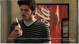
I found the website unique and quirky and found these characteristics followed through to the work. They have created a series of commercials for coca cola drinks and they are really fascinating and intriguing. I was really interested in the one shown in images. The ad takes the ordinary scene of buying a coca cola bottle from a machine and makes gives a mythical look at what happens inside the machine. From putting the coin in the machine to the coin traveling through the machine to the bottle being prepared my mysterious characters to the final shot of the reel coke bottle coming out the vending machine.
I really like the simple idea of this commercial and how it has been produced. The 3d characters have an illustrative feel and look to them which again is quite evident on there website.
Sunday, 12 April 2009
Matthew Gerard 'Steel Life'
I came across a piece called ‘Steel Life’ by Matthew Gerard. I found this piece incredible and some of the visuals are breathtaking. Street life contains beautiful textures and lighting that gives the impression of growth and the birth of life. The piece had no story of narrative to follow but is an expression of the maker and has an abstract nature to it. The sound is a vital element of this piece and really creates an dramatic atmosphere and feeling. I was really inspired and took back when watching this short film as I suppose the creative and technical skills I have learnt during my time studying Multimedia are to be used to tell a story, weather thats a commercial, music video, idents etc. This piece without the backbone of a narrative tells the story or view of the artists mind and visual thinking. Ultimately resulting in a master piece. Also look at the ‘Making of’ which goes behind the scenes of this piece and shows how it developed and was produced.
'Watch final piece' here
'Making of' here
Superfad (American Airlines)
Superfad is a design company with a collective of designers, directors, animators and artists who work within brand design. Working in a range of design areas they have produced work and have such clients as, Honda, Sony, Adidas etc.
I was really impressed and intrigued by Superfad and their work. I really enjoyed their piece for ‘American Airlines’ entitled ‘How I Fly’. The piece revolves around American Airlines new International business class seats and shows the advantages of booking business class. It relates the seat to the different areas of a business man/woman's life, from working on a computer to relaxing watching a film to sleeping. (all showing how these are all accessible from the one business class seat) The visual effects are really effective, the 3D modeled seat is continuously rotating 360 degrees while business life revolves around the seat. The different areas of business life are shown in the seats interface that is also rotating 360 degree around the seat. When each section is being shown the relevant button is shown e.g drink is shown by a symbol of a glass of wine. Overall I really effective and simple piece.
VA Design, ‘Ant 1’ rebrand
I recently came across the company VA Design, which is a Swedish based studio that specializes and provides content for TV, Web and general digital media. Their range of working areas and style is really impressive and the most recent project of theirs is a rebrand for the biggest Greek channel ‘Ant1’. I looked at their showreel for this project and the content is fascinating.
They explain on their website that they “gave the channel a whole new face, divided in 5 sub brands integrating every part and moment of the everyday life of the viewer.” Further more they explain that the best part of the project was that they could integrate “design, motion graphics, 3D and live action, all in one” with this rebrand.
For me I could really relate to there enthusiasm to combining a range of design skills together as through my degree I have enjoyed many areas of Multimedia design and would relish the chance to integrate a few areas together on one project.
The ‘Ant 1’ rebrand is of the highest design standard and you can see just from the rebrand reel that they have related to the target audience to give them the best possible service. Each area of the channel is separated into different sections and comes under several of the channels sub brands. The aesthetic of the channel is has a really clean and polished style but with the combination of live action brings a “playful” and “dynamic” element to the rebrand.
Nylon
Based in Los Angeles, ‘Nylon’ is a design and commercial production studio. They explain on their website that they are “beyond passionate and inspired to make fun, memorable, and interesting work.” from looking at their work and range of skills it is easy to say that they approach each brief/project with the client and audience in mind.
I really enjoyed their piece entitle “The Format, The Compromise” which is a music promo. Again similar to the work of Corin Hardy’s piece for the prodigy this piece is unique and by chance uses paper based characters and stop motion animation. The paper animation is based around the origami paper folding style and animates throughout the video changing colour and through different creatures. Nylon’s website informs us on how they produced this piece explaining, “This project took a small army of traditional animators and one origami artist about two months to complete...We brought this fantasy world to life using a combination of stop-motion animation and compositing.” They continued to explain the hard work that went into every frame which seems to be the side effect of choosing stop motion animation as your medium.
Overall I was pleasantly surprised and and interested in this piece, again like the prodigy music video this steers away from the reoccurring predictable cliché music video and becomes a vibrant summery music promo.
Adolescent 'Nicktoon idents'
Adolescent are based a creative design studio based in New York. Their web site suggests that they “Pride them self's on building strong and thought provoking concepts for forward thinking clients and their visions.”
They work within a range do mediums and uses their creative skills to develop and produce their concepts for entertainment, music, environment and government organizations. Ultimately creating commercials, music videos, idents etc.
I was really impressed by Adolescents creative and concept roots within their work. A selection of idents/promo spots they created for Nicktoon really stood out in my eyes. They created animated idents for Nickelodeon’s cartoon network Nicktoon’s. The series of spots consists of character based animations which revolve ‘vs’ or versus which is a reference to character based fighting games. Each ident is different and uses different scenarios and alternate endings. I think the idents are very bizarre, abstract, and have a psychedelic feel. However I think this is a brilliant concept as it relates to the target audience by referring to video games. Also the idea of alternative endings and a range of scenarios keeps the audience (children) on their toes, interested and surprised. (which I think is the purpose of idents)
Subscribe to:
Posts (Atom)